Back to Portfolio

Design
System

Development of a modular design system to unify and streamline UX across the product ecosystem.

Design System Cover
40%
faster design-to-development handoff due to ready-to-use components and clear documentation
100%
adoption by design, product and dev teams within the first month of rollout
100+
components created with all interactive state and responsive rules for resusability
1x
comprehensive component usage framework with visual examples, dos and don'ts

Project Overview

After years of rapid growth, the product's user experience became fragmented. Inconsistent UI patterns and design decisions had accumulated, creating UX debt that slowed both design velocity and development cycles.

The Opportunity

After years of rapid growth, the product's user experience became fragmented. Inconsistent UI patterns and design decisions had accumulated, creating UX debt that slowed both design velocity and development cycles.

Key Challenges

  • Inconsistent UI – Years of ad-hoc design without a system led to mismatched components and visual inconsistencies.
  • Poor Scalability – The existing design couldn't support the pace of new feature development.
  • Cross-Team Misalignment – Designers and developers struggled to stay aligned due to unclear specs and lack of standardized components.
  • Slow Development Cycles – Low reusability and high redesign, causing delays in both design and engineering handoff.
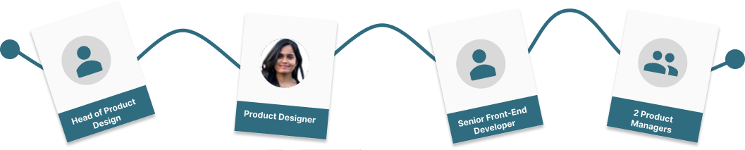
The Team

We operated as a cross-functional taskforce focused on establishing governance for the design foundation.

Design System Team

The Process

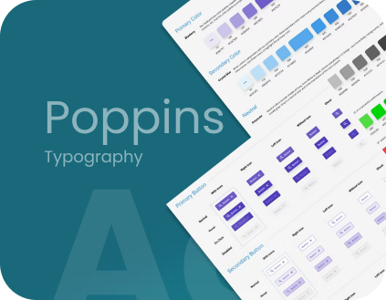
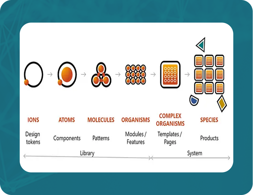
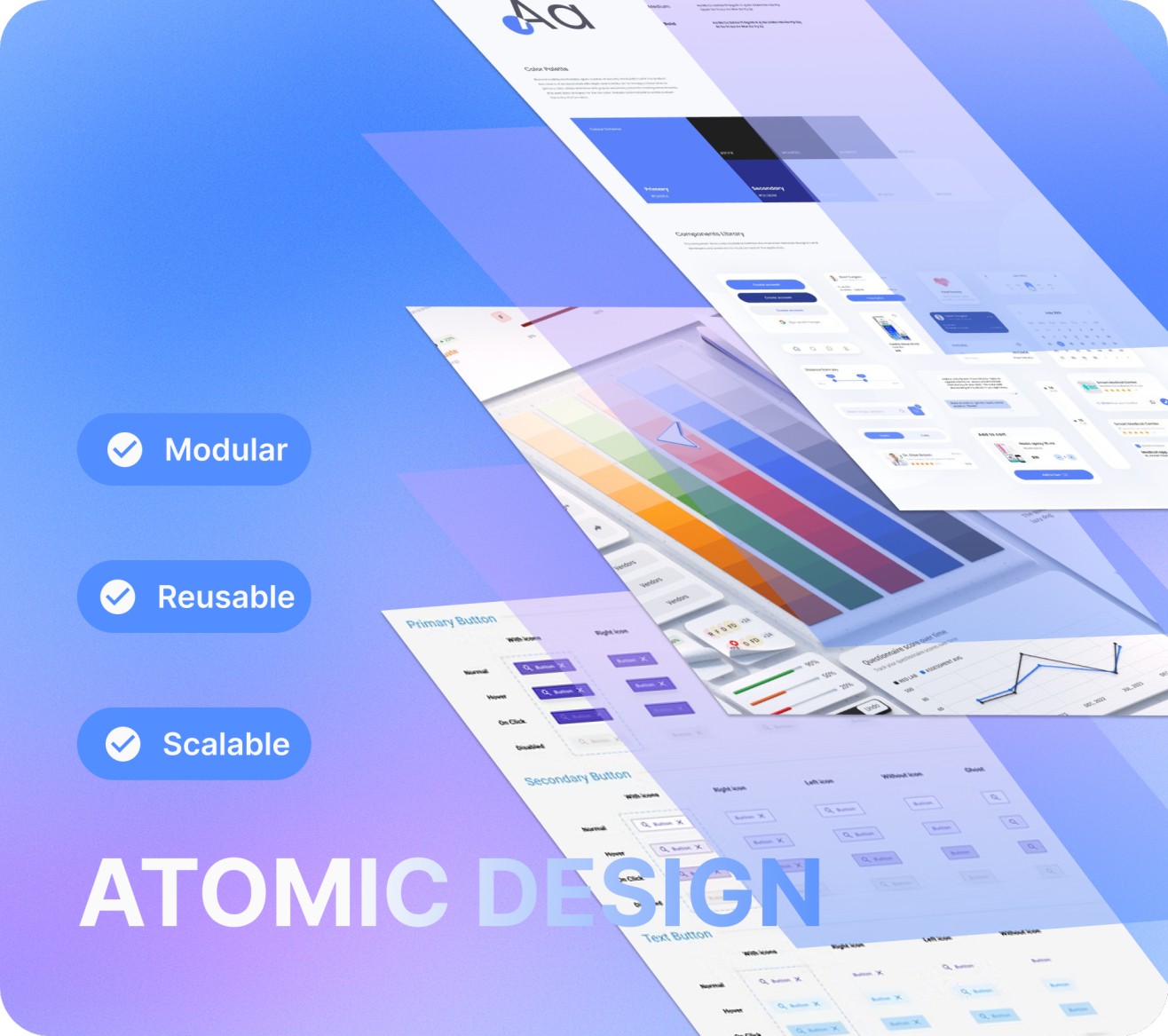
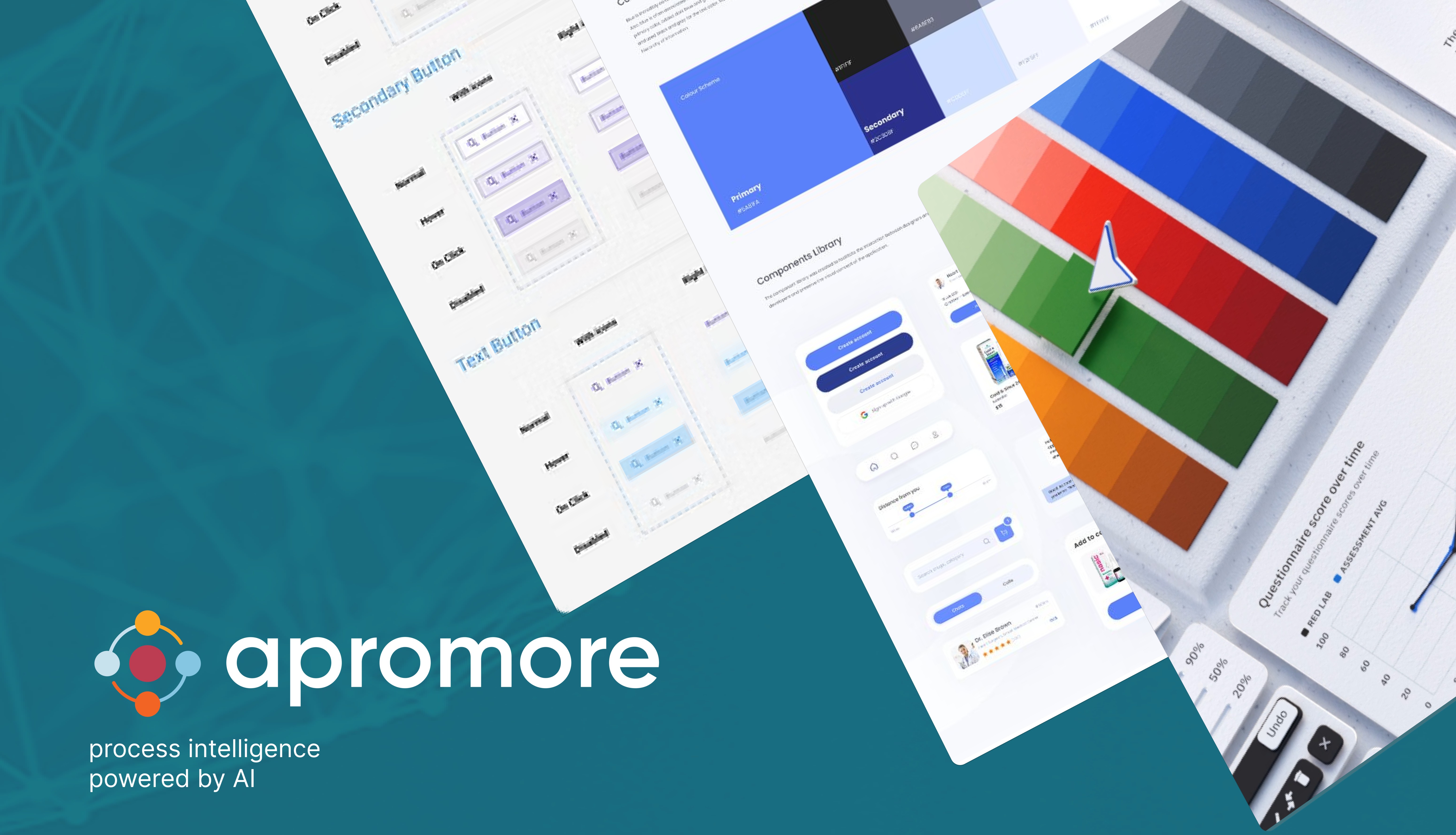
We adopted the atomic design approach to bring order and clarity to a fragmented UI landscape. Through structured audits, workshops, and detailed documentation, we built a scalable foundation for consistent design.

1. Component Inventory & UX Audit
Discovery
We conducted a thorough audit of existing UI components across different projects, identifying inconsistencies and redundancies. This helped us create a comprehensive list of essential components.
2. Internal Workshops
Collaboration
Collaborative workshops with product, design, and dev ensured every component met both UX and implementation needs. We aligned on tokens, naming conventions, and usage.
3. Standardized Figma Library
Implementation
We established a well-organized Figma library with clear naming conventions, variants, and auto-layout structures, making it easy for designers to build interfaces quickly and consistently.
4. Iterative Testing & Feedback
Validation
The design system was continuously refined through testing, usability reviews, and feedback to ensure practical usability and adoption.
5. Documentation & Governance
Sustainability
Built clear usage guidelines, component anatomy, and interaction rules to enable adoption and minimize misuse.

The Outcome

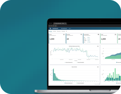
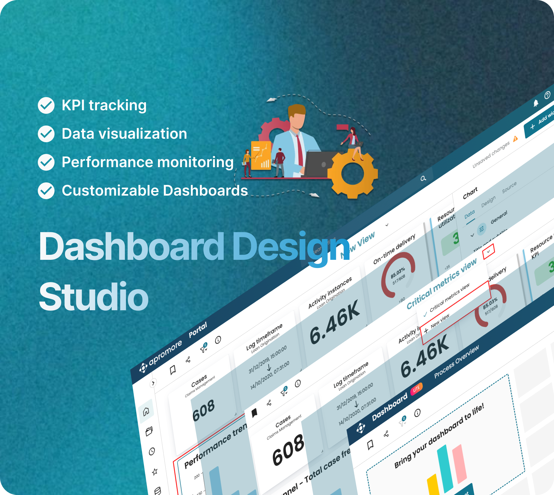
The new system served as the single source of truth, eliminating inconsistencies and visual clutter across the product. It brought structure and clarity, allowing designers and developers to move faster with confidence. The modular setup offered flexibility to scale with new features while preserving consistency and quality.

Key Results

  • A shared library improved visual consistency across screens and platforms
  • Design and dev cycles were faster with reusable, tested components
  • The system is extensible, supporting new modules and features without design regression
  • A documented framework and version control ensured sustainable design practices and reduced future debt
40%
faster design-to-development handoff due to ready-to-use components and clear documentation
100%
adoption by design, product and dev teams within the first month of rollout
100+
components created with all interactive state and responsive rules for resusability
1x
comprehensive component usage framework with visual examples, dos and don'ts
Design System Component Library
Design System Documentation
Design System Implementation