Back to Portfolio

Dashboard Design Studio

Led the redesign of a data-heavy SaaS dashboard studio that allows business users to fully customize their trend analysis view.

Dashboard Design Studio Cover
100+
core components designed with configurable behavior and design logic
5+
core user flows prototyped and validated through usability testing
30+
Jira tickets created with full interaction specs, edge cases, and dev notes
90%
users rated the redesigned experience 4/5 out of 5 for usability and visual clarity
2x
faster task completion during usability testing for key actions like sharing and styling a card
40%
faster design-to-development handoff due to ready-to-use components and clear documentation

Project Overview

Apromore is a process mining software used by business analysts to monitor and improve business operations.

The Feature

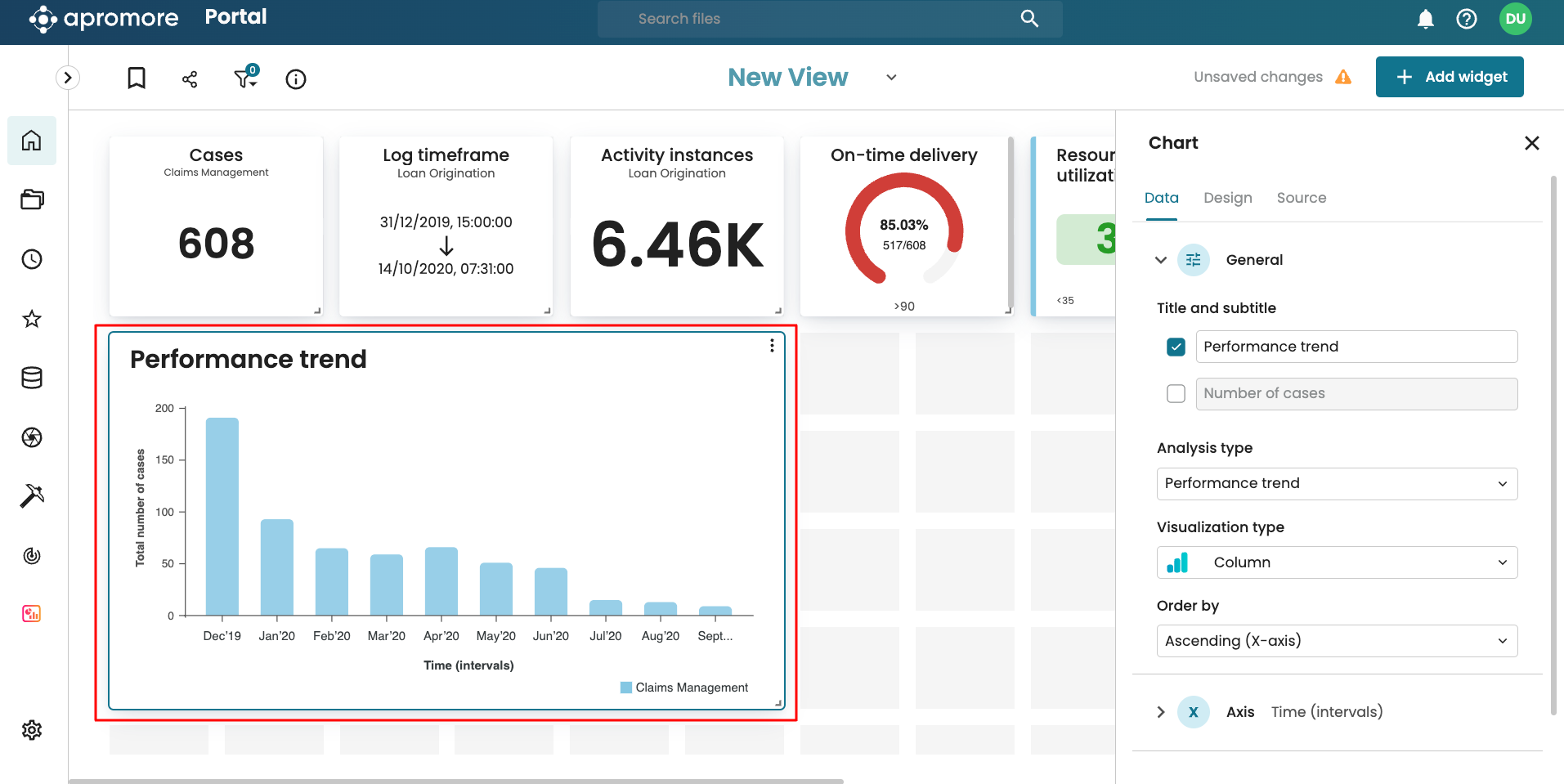
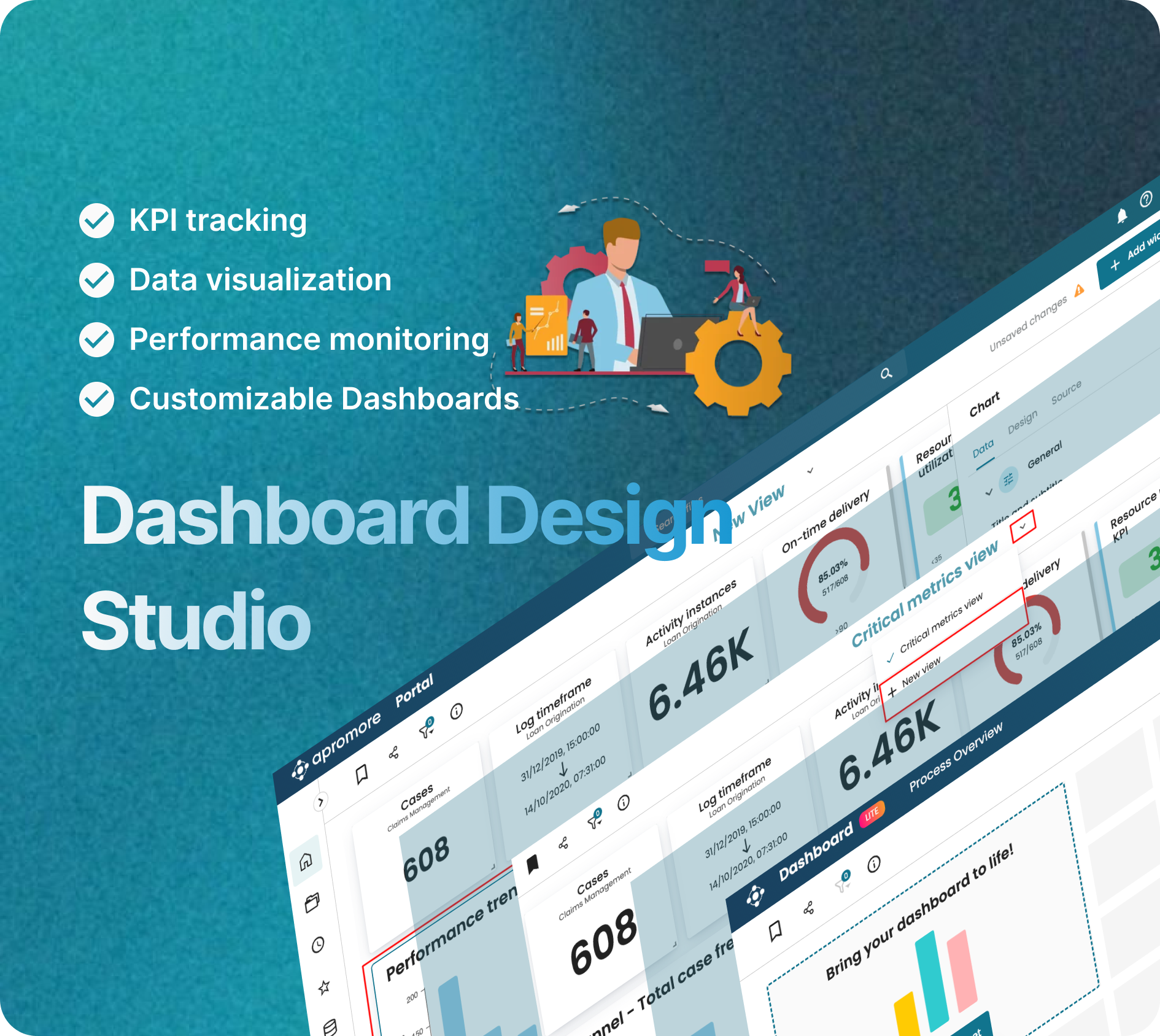
The Dashboard is a core feature of Apromore that allows users to track KPIs, visualize trends, and share process insights across teams.

The Problem

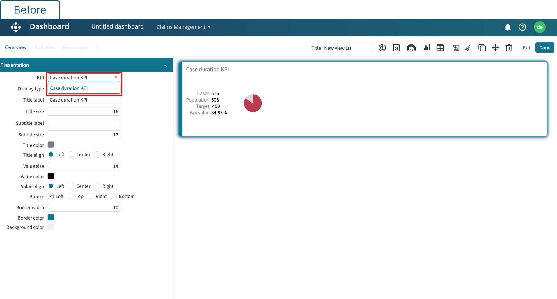
The classic dashboard in Apromore allowed users to view and track KPIs — but the experience was rigid and inflexible:

  • Lack of Flexibility – Dashboards were predefined and static, with no option to add or customize widgets
  • No Modular System – Every dashboard was hardcoded and resulted in long dev cycles for updates
  • Unclear Hierarchy & Layout – Lack of a grid system or consistent layout led to cluttered and hard-to-scan dashboards
  • Legacy UI – The old UI lacked modern look and feel. The redesign was aimed to migrate the UI to a modern react framework

A consistent demand for more control and speed by customers pointed out that the classic dashboard became a bottleneck and the dashboard redesign project was born.

Dashboard Context - Before State

The Scope & The Squad

The objective was to transform the legacy dashboard into a fully self-serve, modular dashboard studio.

Key Redesign Features

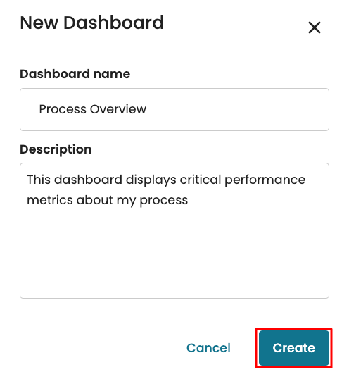
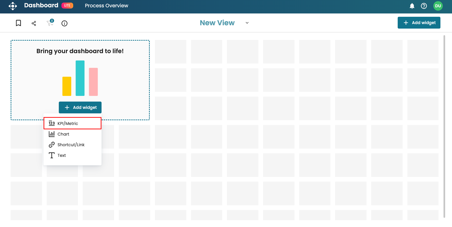
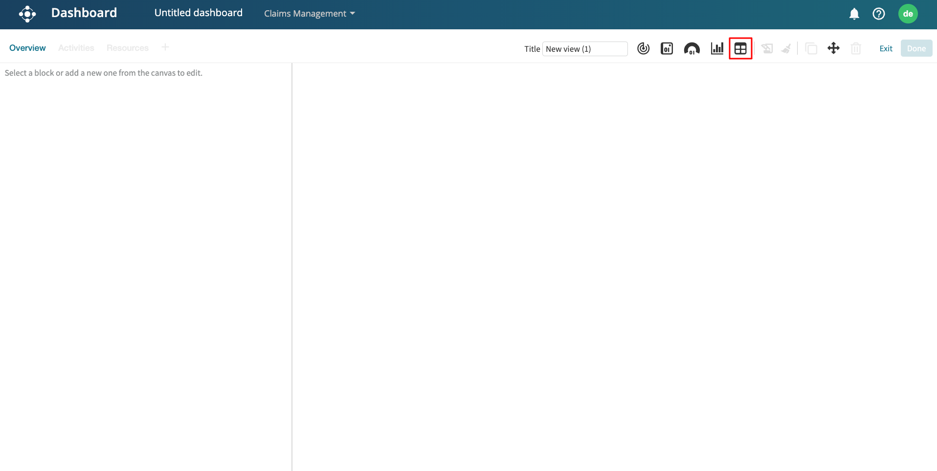
  • Create dashboards from scratch using a flexible, grid-based canvas
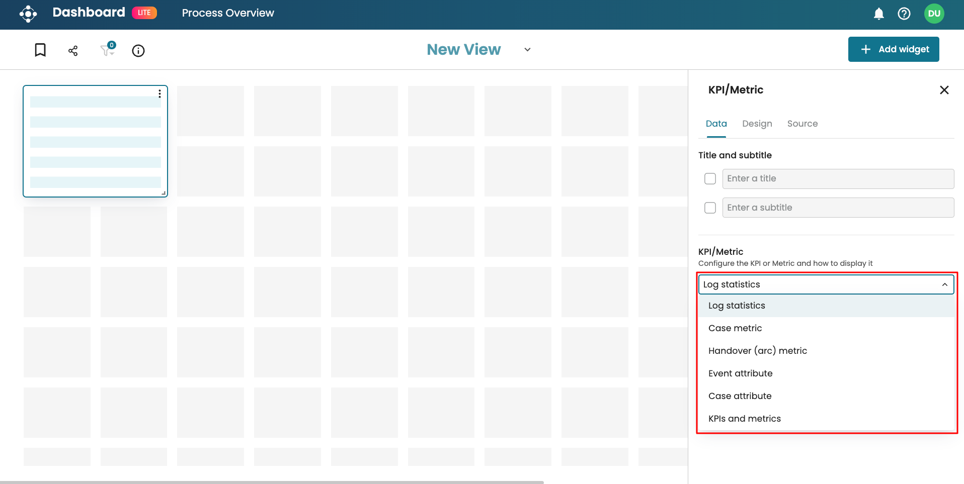
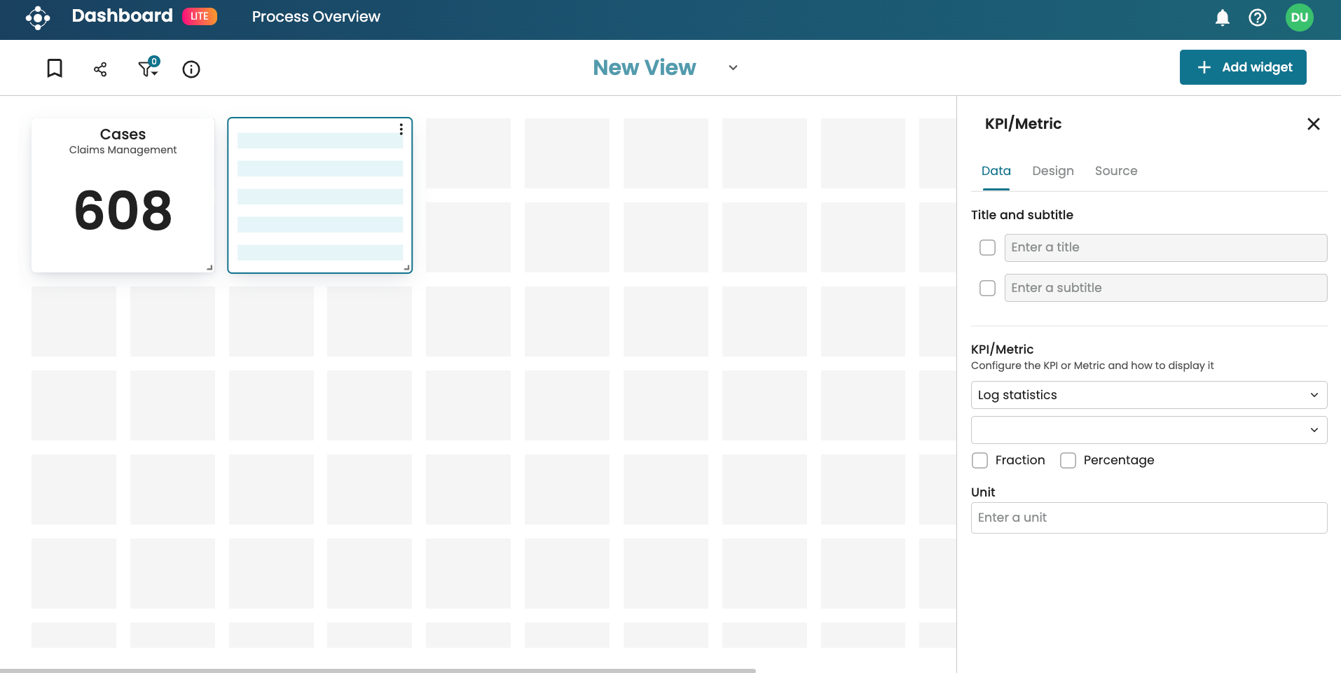
  • Add and configure widgets(KPIs, Charts, Text, Links) based on business needs
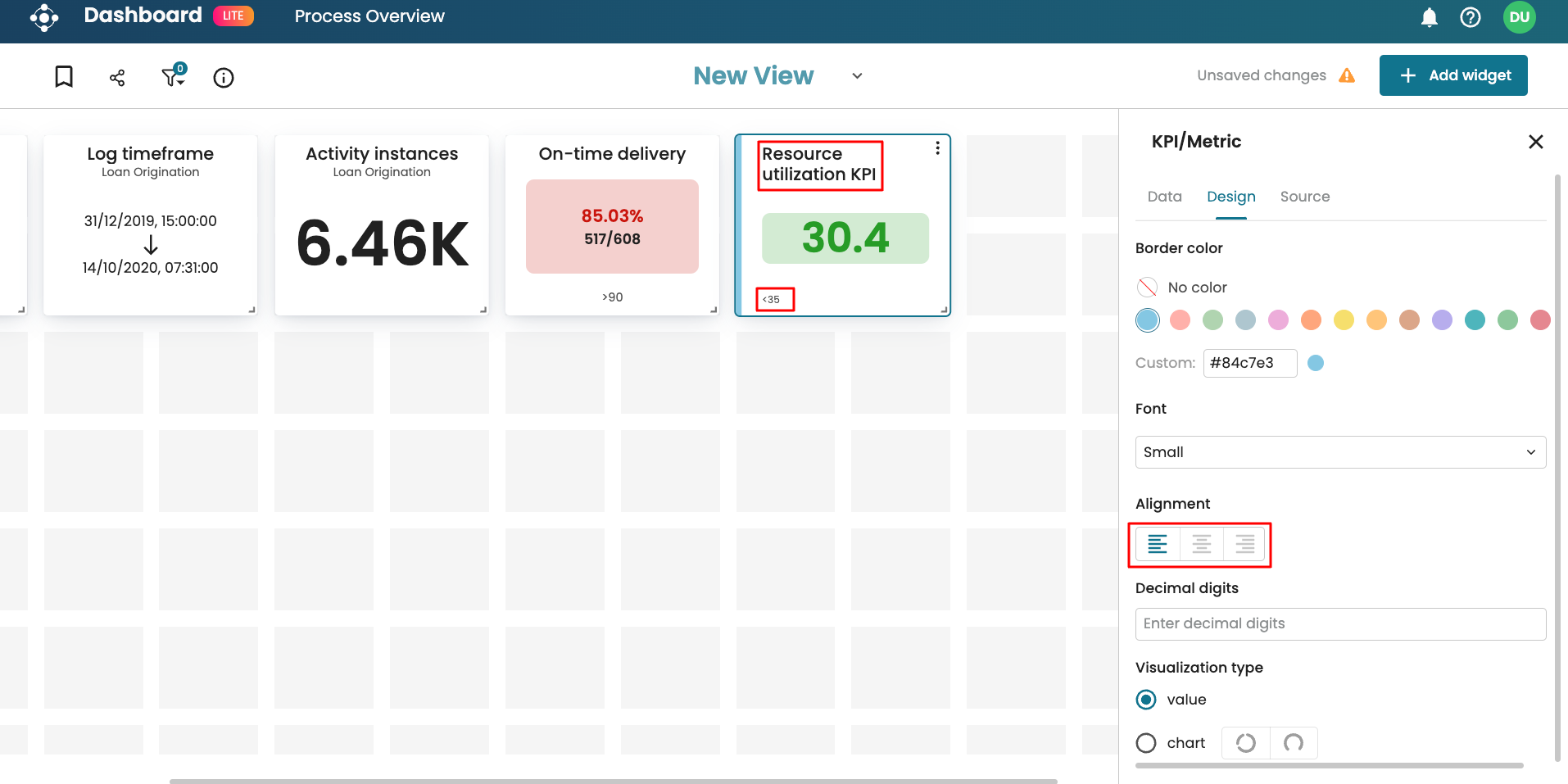
  • Resize, reposition, and edit widgets in real time — without leaving the screen
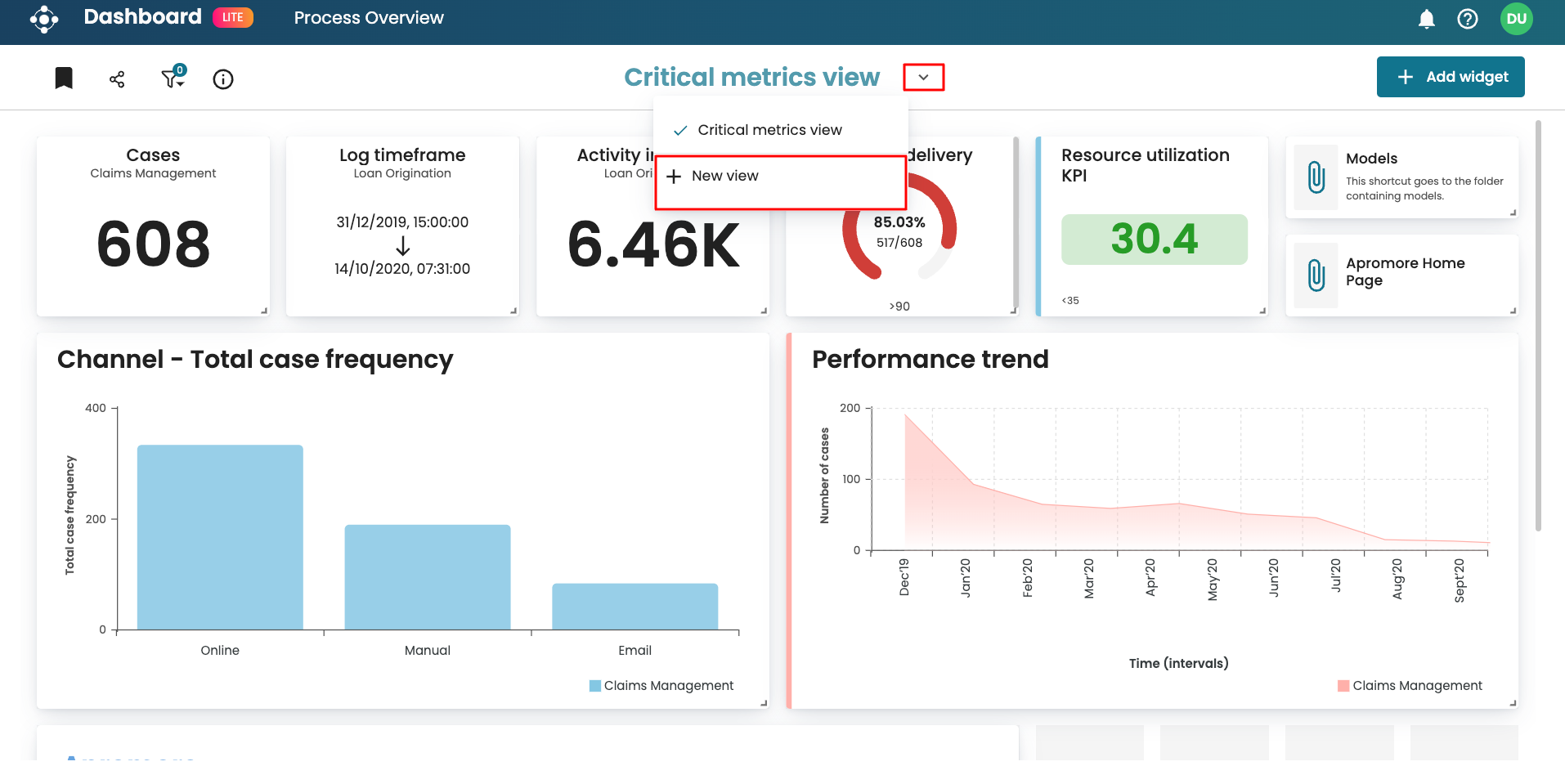
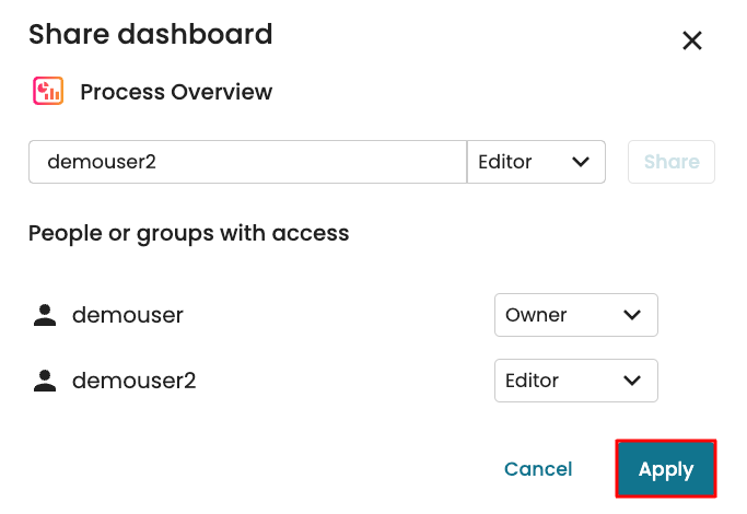
  • Apply filters, switch between views, and share dashboards across teams
  • Do all of this with a easy to use drag and drop interface

We aimed to make data insights "as configurable and accessible as a slide deck", but grounded in real-time process intelligence.
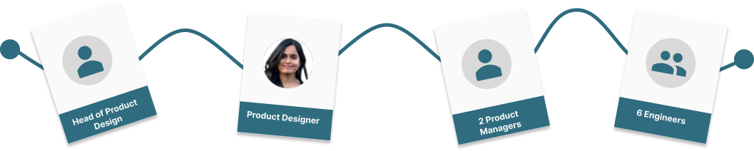
The Team

To bring this vision to life, we worked in a product triad:

  • I led UX and interaction design, covering all the core components in dashboard (refer to the deliverables on the right)
  • Product managers shaped requirements and aligned the roadmap
  • Engineers partnered with us closely to validate technical feasibility

This close collaboration helped us move fast, test early, and ship with confidence.

Dashboard Design Studio Team

The Design Sprint

We worked in agile sprints and followed an iterative design process. We prioritized continuous feedback and close collaboration between design, product and engineering. Each phase from discovery to developer handoff was focused on meeting user needs and feasibility checks.

1. User Research & Workflow Mapping
Through relationship managers, we uncovered key friction points—especially around interpreting complex models. Users wanted help that was fast, contextual, and trustworthy.
2. Ideation & Sketching
Each designer contributed based on their scope. As the lead designer, I was responsible for led the design of core building blocks—widgets, interaction flows, settings panels, tab navigations, and the toolbars.
3. Feedback Loops & Stakeholder Reviews
Designs were shared iteratively across design, dev and business stakeholder reviews. We held async feedback cycles and co-working sessions to validate flows, component logic, and user scenarios.
4. Iterate & Iterate Some More
We refined wireframes and prototypes through multiple usability rounds. Designs progressed through a structured Jira design board, moving back and forth from In Design → In Review → In Card Writing → Done.
5. Jira Cards & Developer Ready Specs
To support smooth implementation, I wrote detailed Jira tickets for each widget and UI element I designed. These tickets included design context, interaction logic, edge case handling, and direct links to Figma files—ensuring developers had everything needed to build with clarity and accuracy.

The Outcome

What once was a rigid, developer-dependent interface became a self-serve canvas that gave business users full control to explore, organize, and act on process insights.

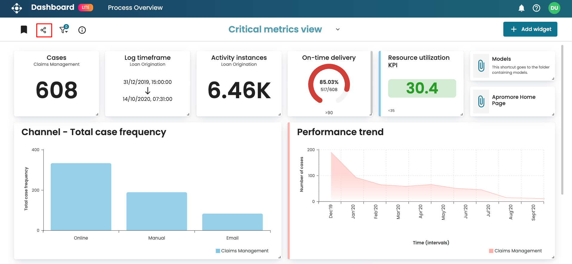
The Dashboard Design Studio came out as a fully customizable, user-friendly canvas for creating and organizing process insights at scale. Users could build the exact data visualization view they need with ease and simplicity. This redesigned feature became a flagship element of the product.

Key UX Deliverables

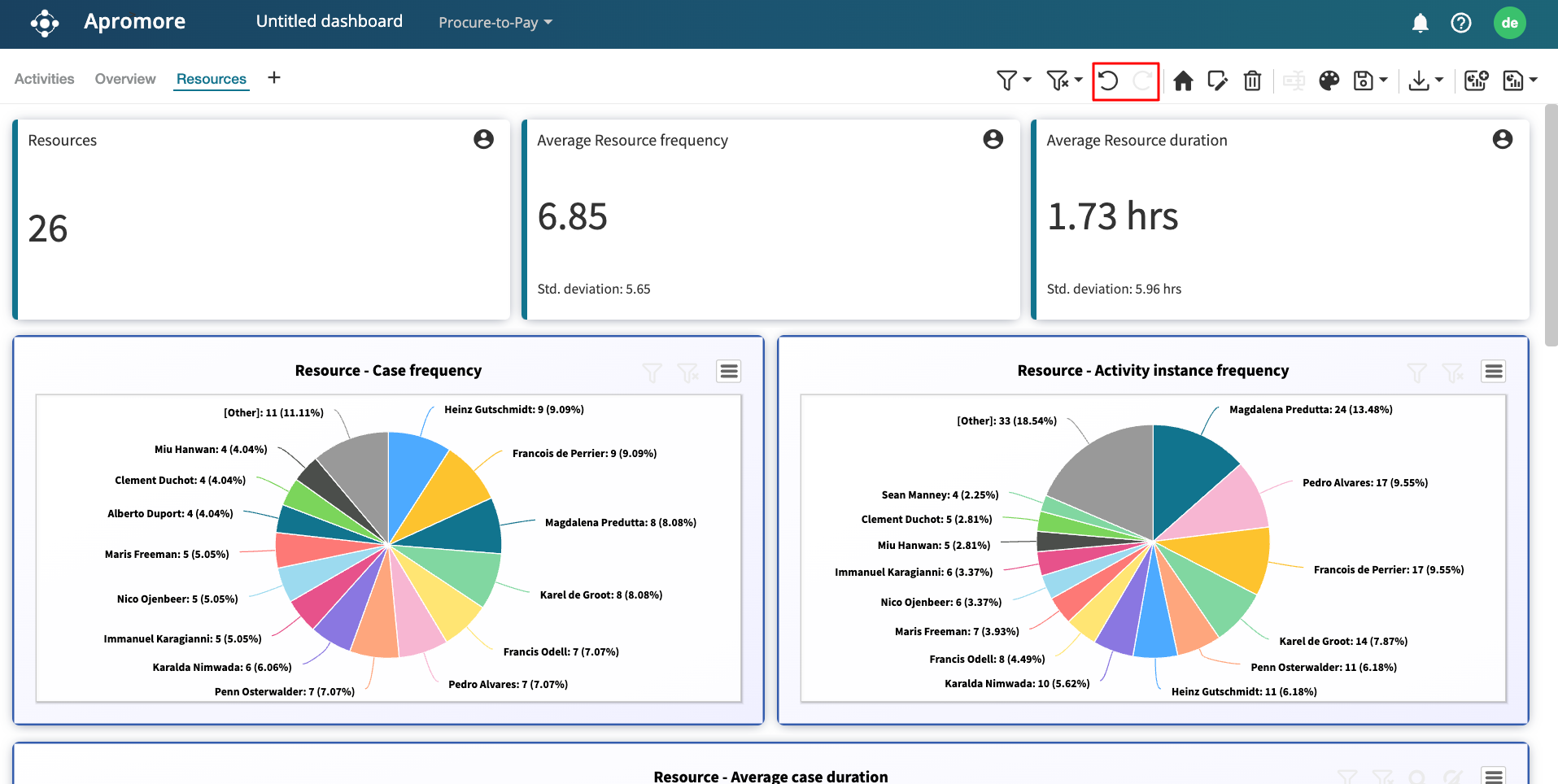
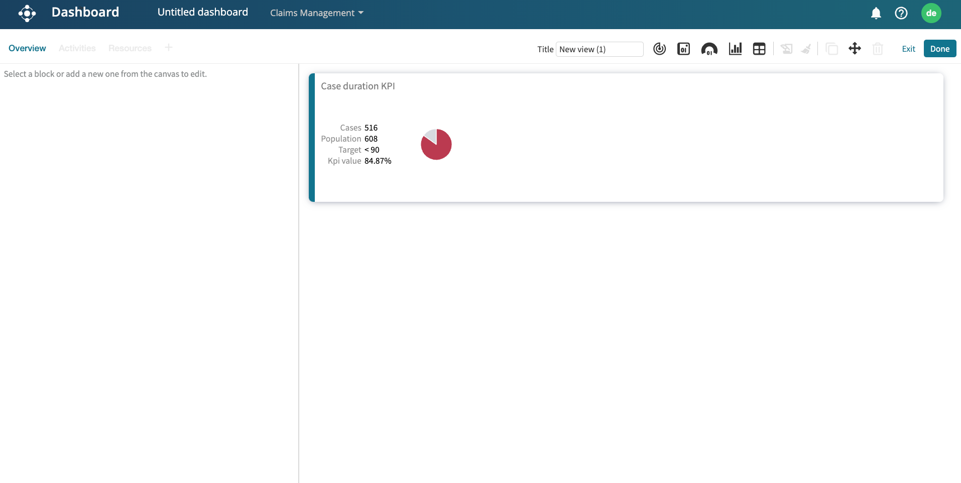
  • Flexible grid-based canvas with smart resize, snap-to-align, and responsive spacing rules
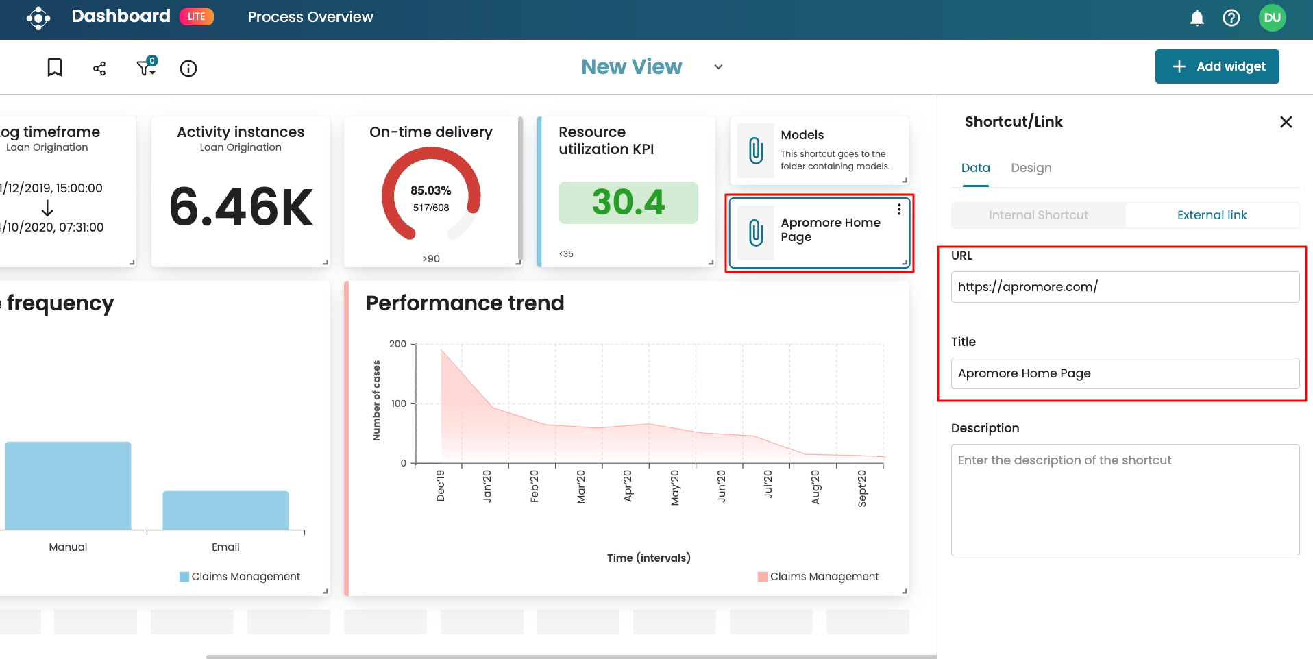
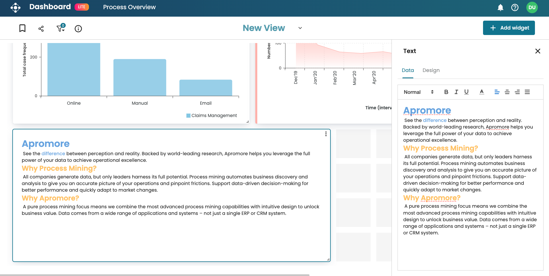
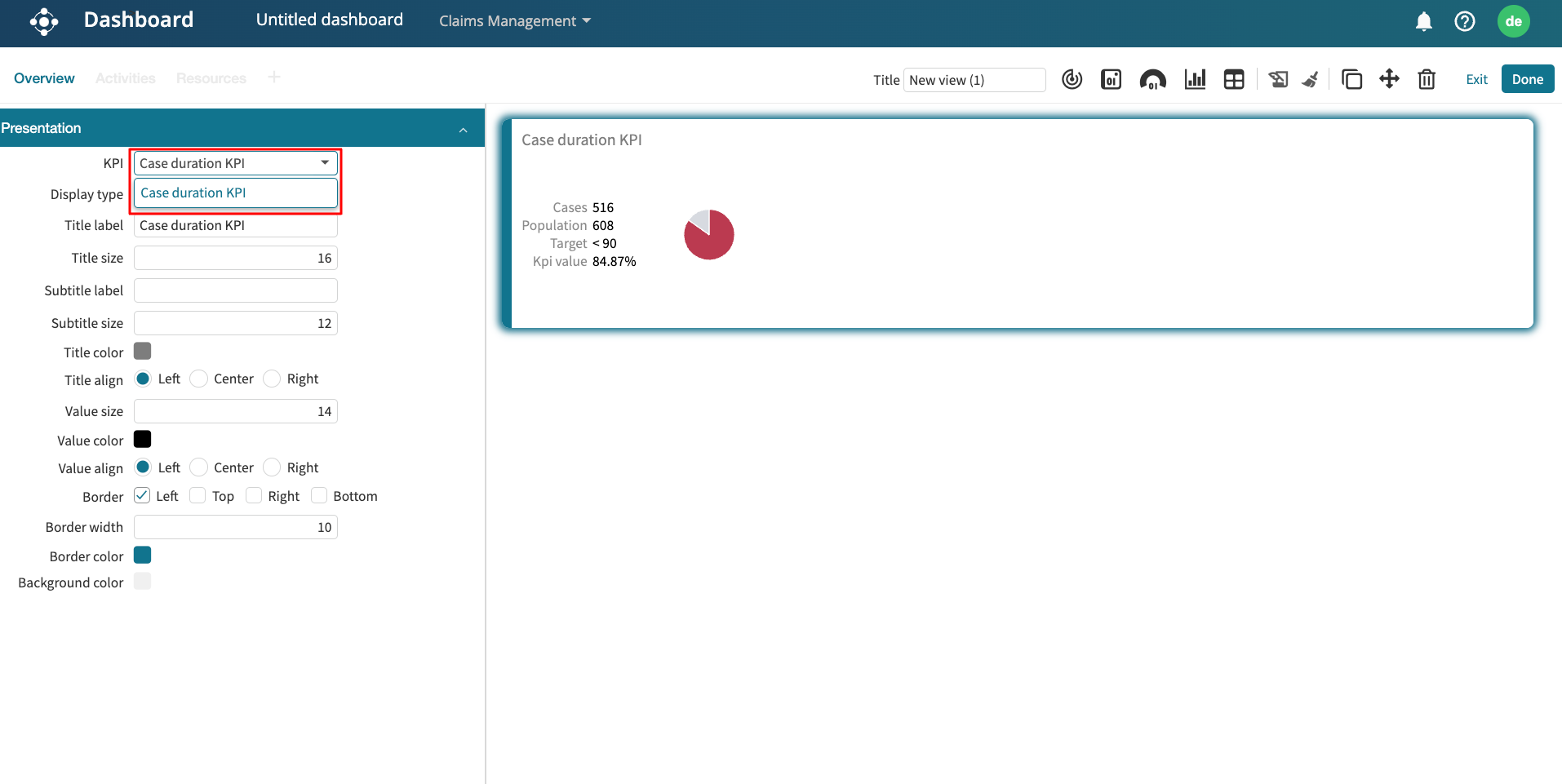
  • Widgets system created with 6 fully configurable types: KPI, Chart, Text, Link, Shortcut, and Placeholder
  • Settings panel UX built to control content, visuals, filters, and widget-specific behaviors
  • Navigation & toolbar components designed to support tab switching, dashboard actions, and responsive behavior
  • Figma component library structured with reusable components mapped to design tokens and states
100+
Core components designed with configurable behavior and design logic
5+
Core user flows prototyped
30+
Jira tickets created with full interaction specs, edge cases, and dev notes
90%
Users rated the redesigned experience 4/5 out of 5 for usability and visual clarity
2x
Faster task completion during usability testing for key actions like sharing and styling a card
40%
Faster design-to-development handoff due to ready-to-use components and clear documentation

UX Flows Walkthrough

A step-by-step overview of the core dashboard workflows, paired with UI snapshots. Each section showcases how users interact with the dashboard and how the UI adapts to different needs.

Create Dashboard

Users click Add new, name the dashboard, and land on a clean, grid-based canvas—ready to add and arrange widgets.

Create Dashboard Step 2
Create Dashboard Step 1 Create Dashboard After State
Create Dashboard Step 3

Add Widgets

Users can drag and drop widgets like Charts, KPIs, Text, or Links onto the canvas. Each widget adapts to the grid, supports resizing, and can be configured via a settings side panel.

KPI / Metric Widget

Displays high-level numeric insights like case counts, durations, or percentages. Users choose a metric, set formatting, and optionally apply thresholds or comparison logic.

KPI Widget Example

Chart Widget

Users can select from various chart types (bar, line, etc.) and bind them to process data. Configuration includes choosing dimensions, metrics, and filters via the settings panel.

Chart Widget Example

Text Widget

Ideal for adding context, headings, or notes. Users can enter rich text, style it, align content, and adjust the border to match dashboard themes.

Text Widget Example

Link / Shortcut Widget

Lets users add navigation links to other dashboards or external tools. Configurable label, icon, and URL field make it simple to create useful quick-access tiles.

Link Widget Example

Edit Widgets

Users can click on any widget to open its settings panel. Here, they can update the content, appearance, or data bindings in real time—without leaving the canvas.

Edit Widgets Example

Format Content

Users can customize each widget's content and appearance—adjusting text alignment, font styles, border color, and background—all from the settings panel.

Format Content Example

Resize Widget

Widgets can be resized directly on the canvas by dragging their corners. The snap-to-grid system ensures alignment and consistency across layouts.

Resize Widget Example

Manage Dashboard

Once dashboards are created and configured, users need comprehensive tools to manage, share, and maintain their data insights. The redesigned dashboard allows essential workflows that enable collaboration and dashboard lifecycle management.

Manage Views

Users can create, save, and switch between multiple views to customize how data is presented for different use cases.

Manage Views Example Manage Views Example 2

Share Dashboard

Dashboards can be shared with colleagues through permission controls, enabling collaborative access.

Share Dashboard Example Share Dashboard Example 2

Edit Dashboard

Users can edit a dashboard to change widgets, data sources, or its design. To edit a dashboard, users open the Dashboard page in the Portal and select the dashboard to edit.

Edit Dashboard Example

Before vs After

Compare the legacy dashboard experience with the redesigned, user-friendly interface that transformed how business users interact with their data.

Before - Legacy Dashboard

The legacy dashboard had a rigid layout, limited customization, and inconsistent UI patterns, making it hard for users to create meaningful insights efficiently.

Legacy Dashboard 1
Legacy Dashboard 2
Legacy Dashboard 3
Legacy Dashboard 4

After - Redesigned Dashboard

The redesigned dashboard introduced a flexible, component-based canvas with improved usability, responsive design, and end-to-end customization through a clean, modern UI.

Redesigned Dashboard 1
Redesigned Dashboard 2
Redesigned Dashboard 3
Redesigned Dashboard 4

Key Learnings

Iterative feedback drives success:

During this project, regularly syncing with engineers helped me understand technical constraints early, which saved us from redesigning later. At the same time, hearing business stakeholders' priorities pushed me to balance user needs with company goals. This constant back-and-forth taught me that great design is never done in isolation — it's a team sport where communication is everything.

Clear development specifications is essential:

I realized that if I want my designs to be built right and fast, I need to make the handoff as easy as possible for developers. So I got really intentional about documenting states, spacing, and behaviors in Figma, then broke down everything into digestible, actionable Jira cards. This saved so much back-and-forth during development and helped keep everyone aligned.