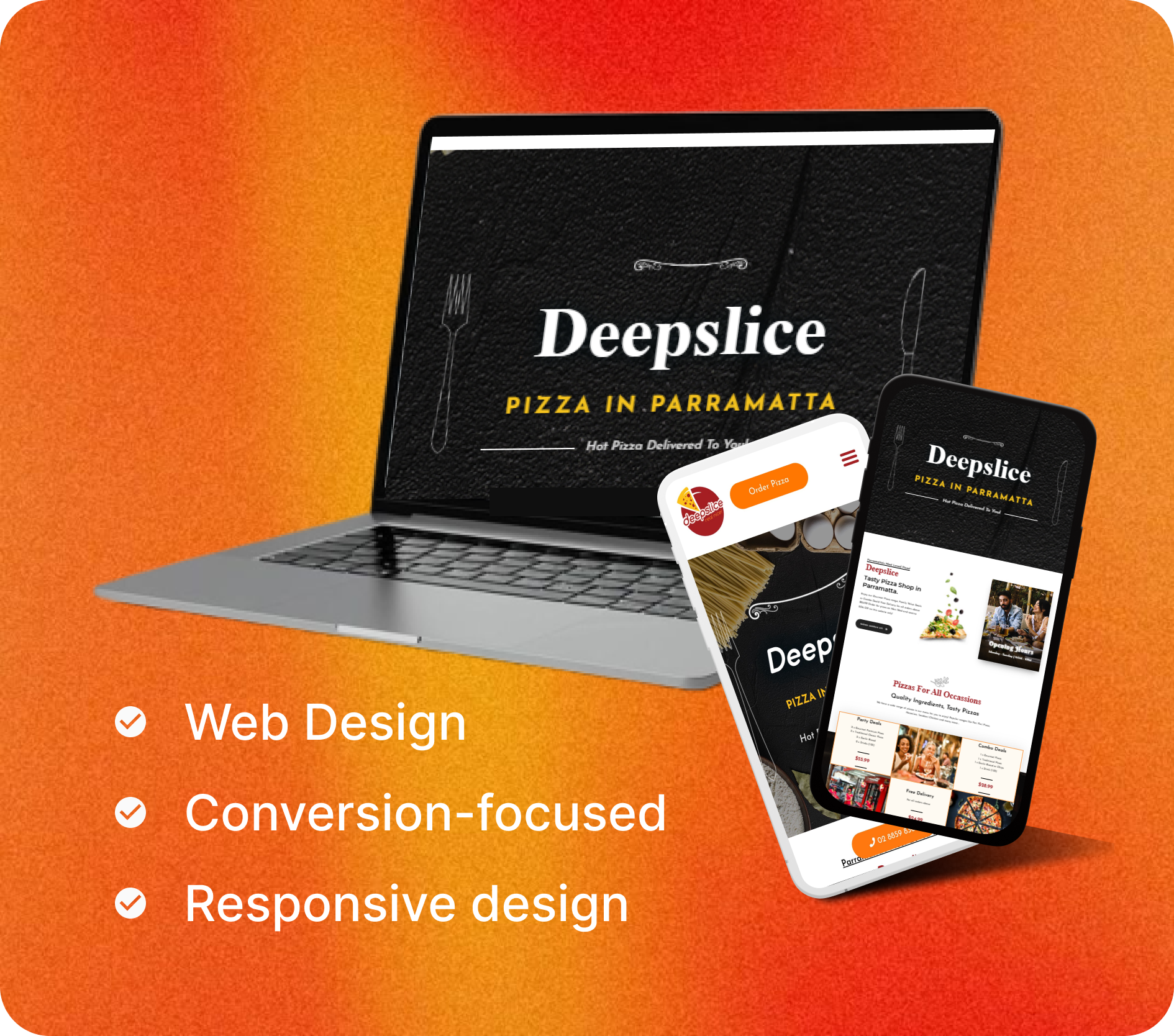
Project Overview
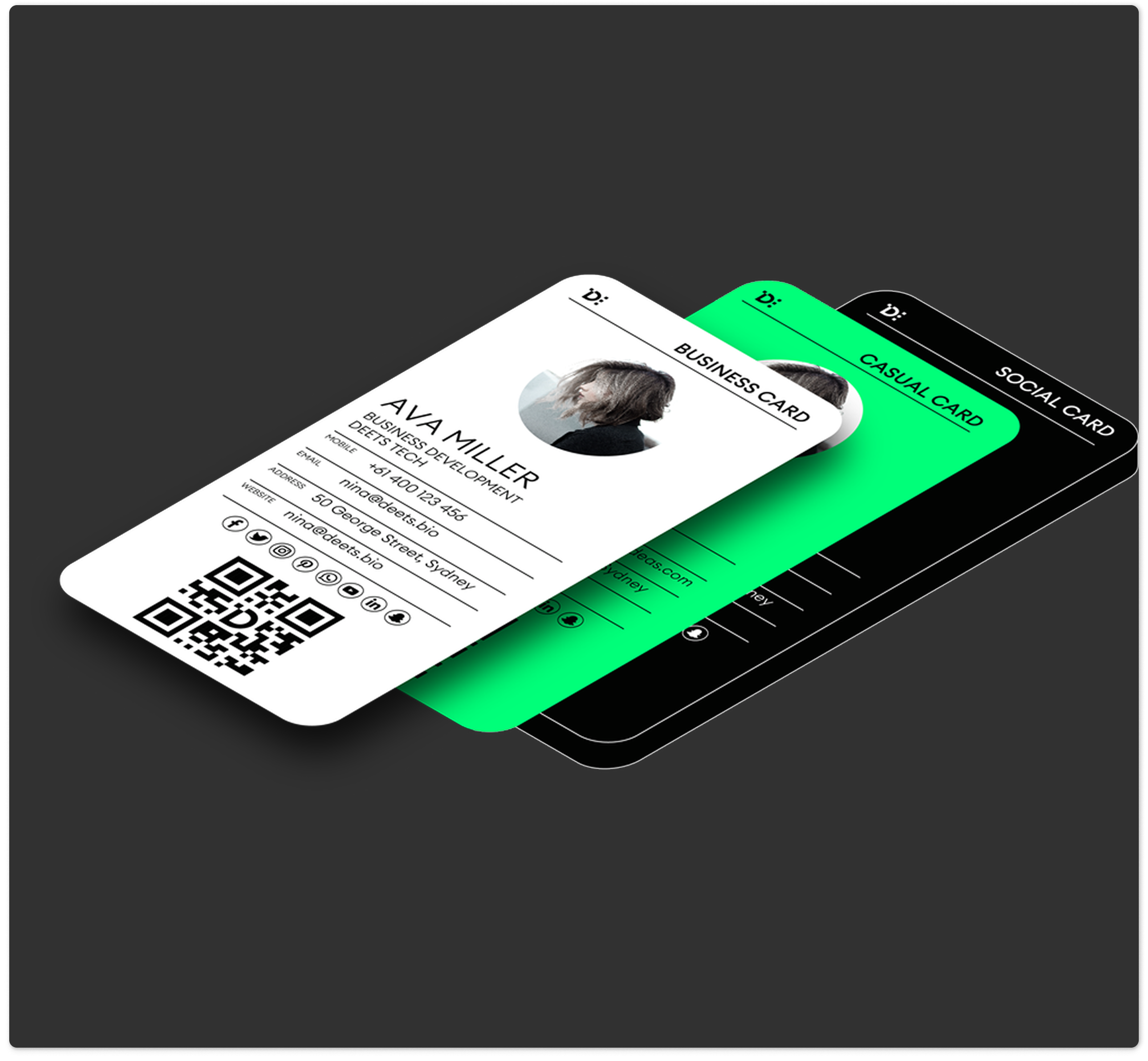
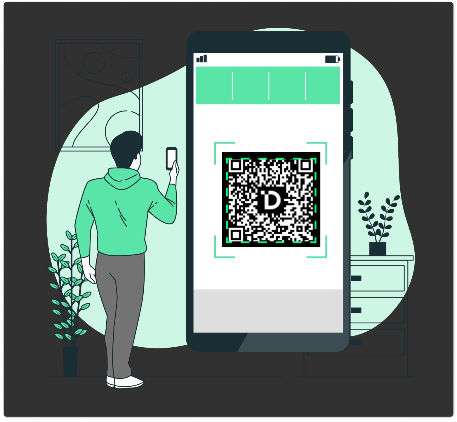
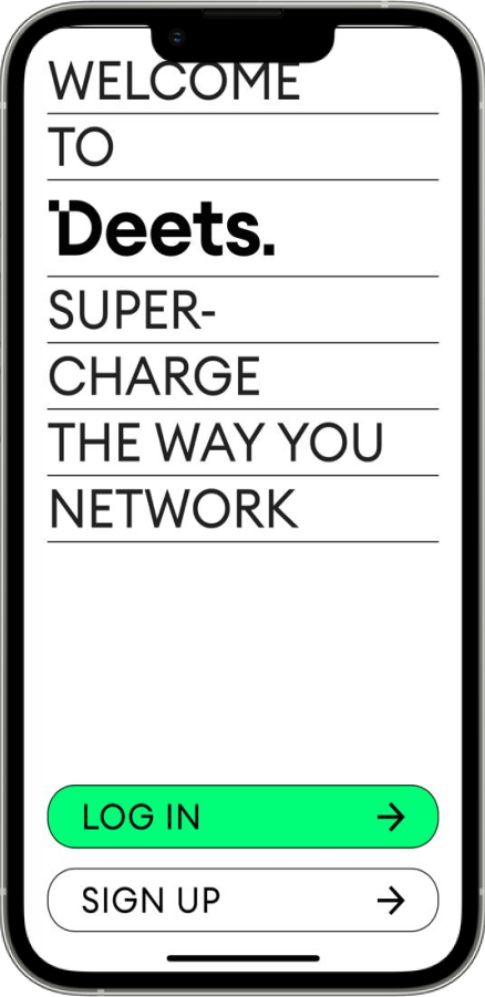
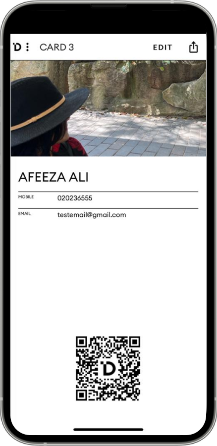
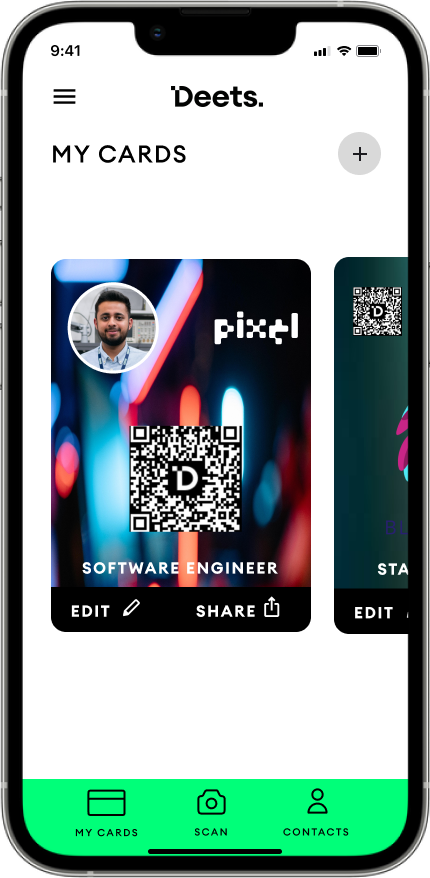
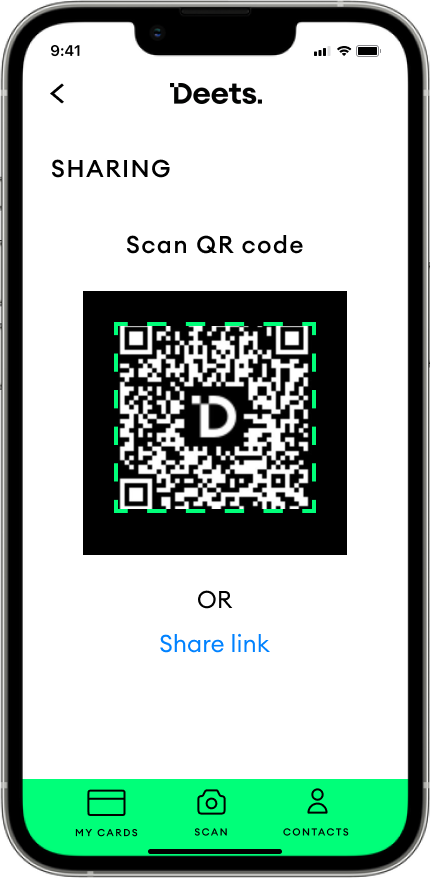
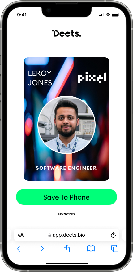
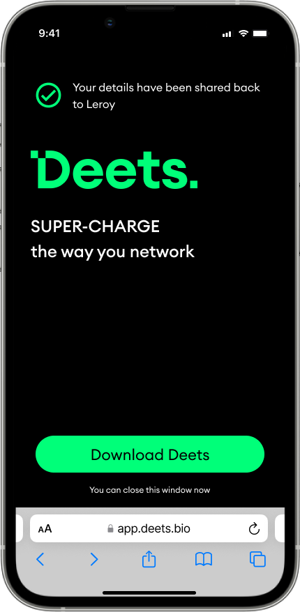
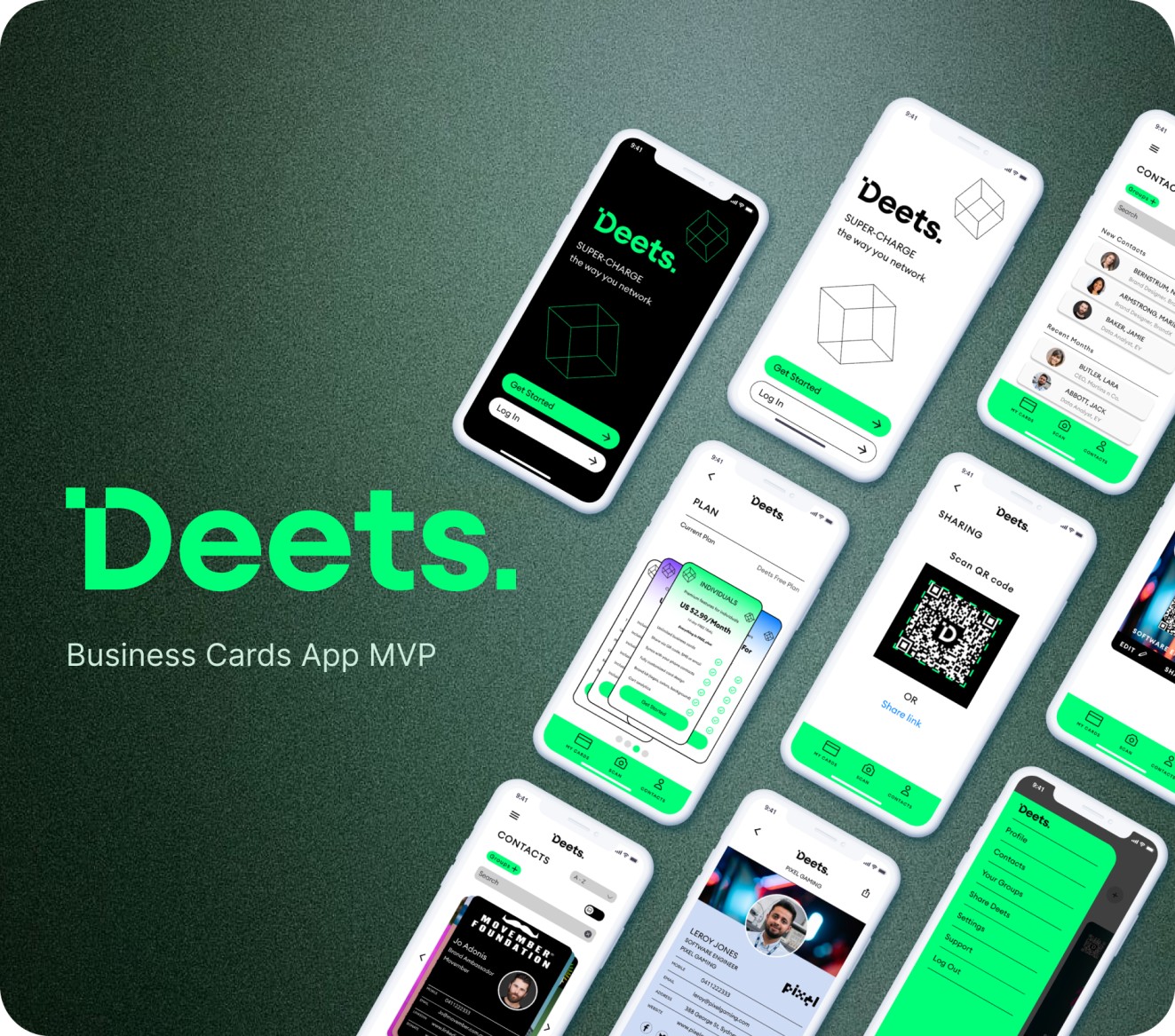
The client, a tech startup, is an Australian digital business card app tailored for professionals and business teams, empowering users to effortlessly create and share digital business cards using QR codes and links.
The Product & The Scope
The client, a tech startup, is an Australian digital business card app tailored for professionals and business teams, empowering users to effortlessly create and share digital business cards using QR codes and links.
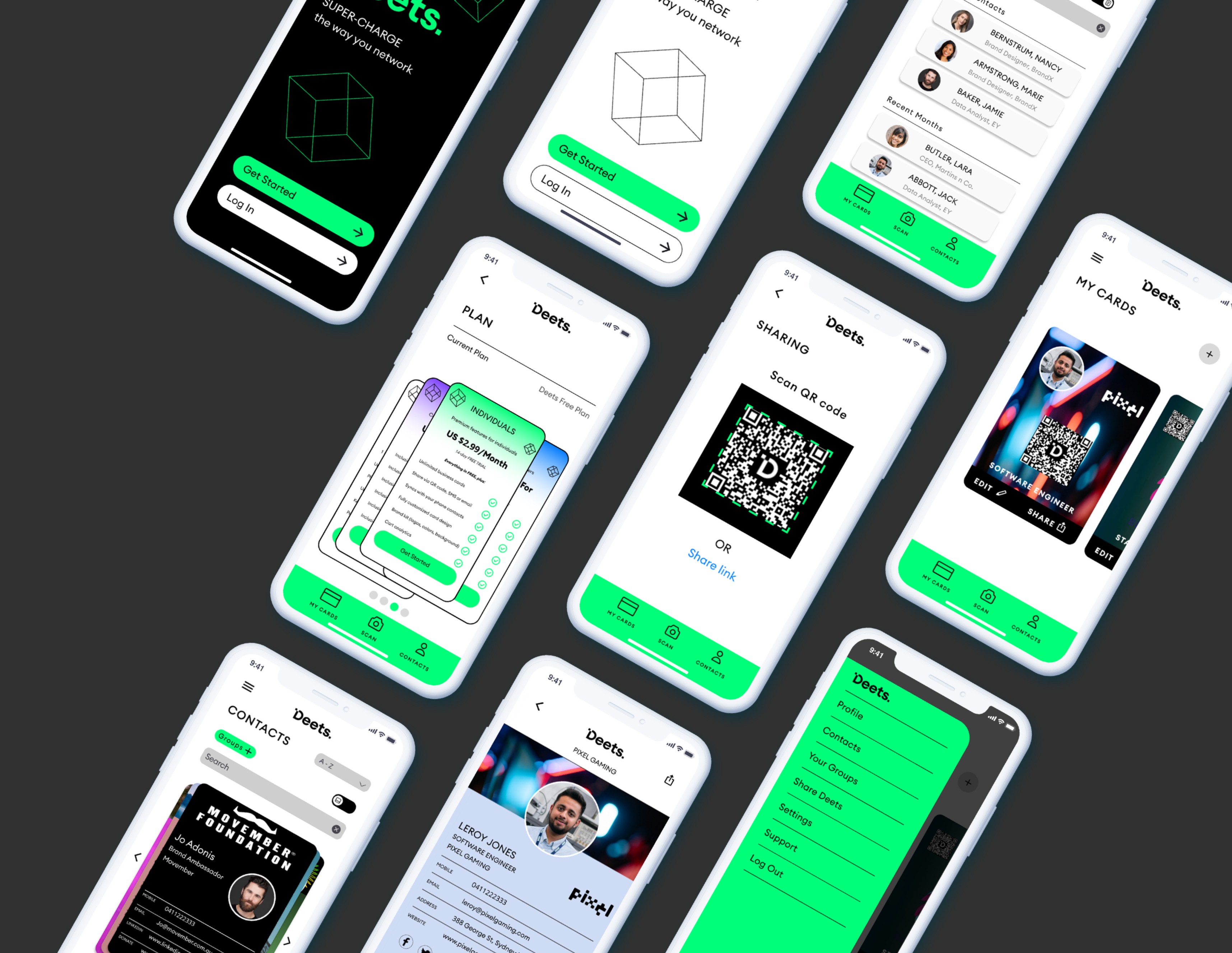
Deets faced specific user adoption challenges:
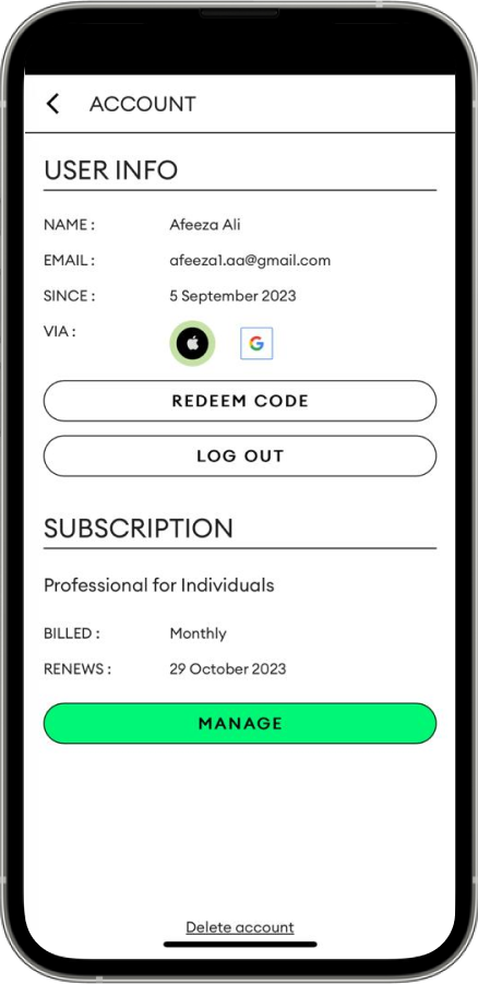
- Low User Adoption – Users were hesitant to adopt the app due to challenges in understanding its value, usability concerns, and security apprehensions.
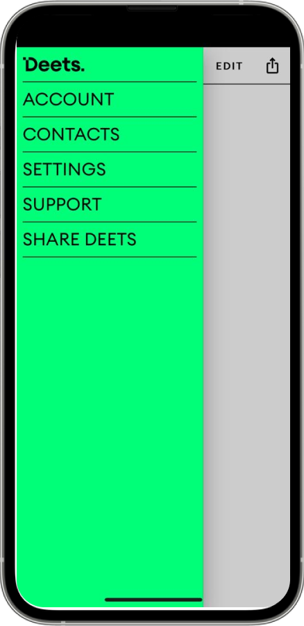
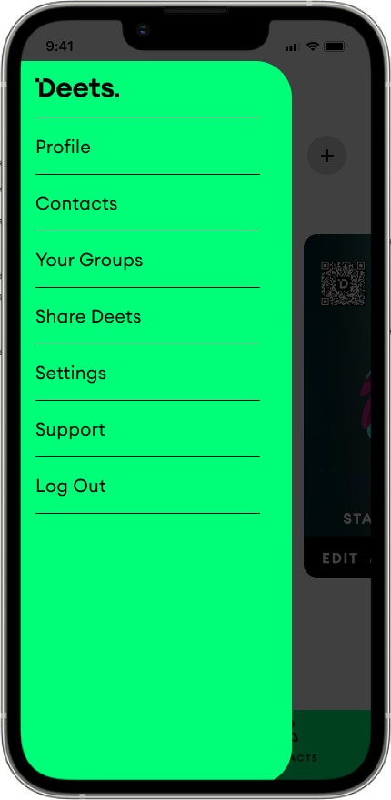
- Complex Onboarding – The onboarding process was unintuitive and confusing, leading to user frustration.
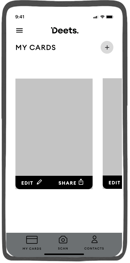
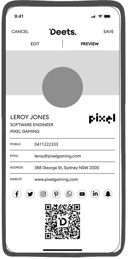
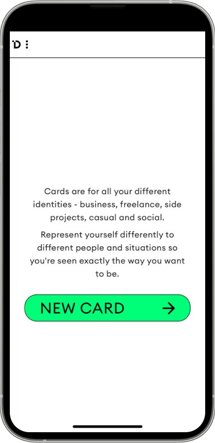
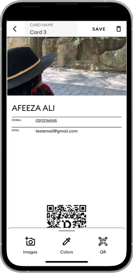
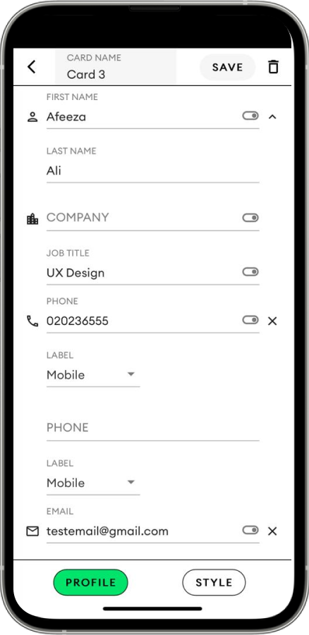
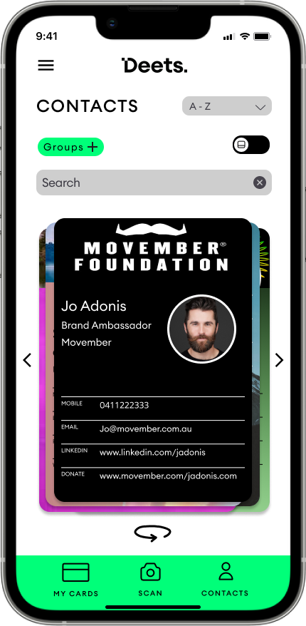
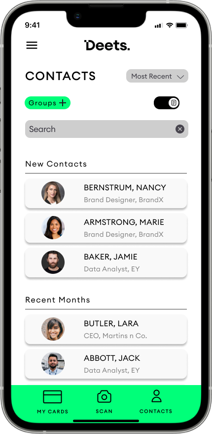
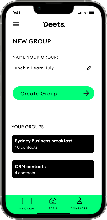
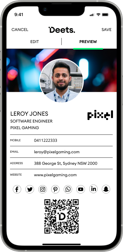
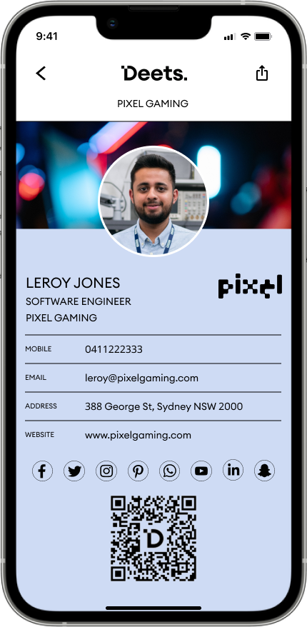
- Unintuitive Task flows – Users found styling their business cards challenging due to a non-intuitive interface.
- Unclear Value Proposition – There was a lack of a clear and compelling value proposition, leaving potential users uncertain about the app's unique benefits.
The Team
We were a small but focused squad, combining design, research, and product practice. We closely collaborated between our internal team and the client side team.

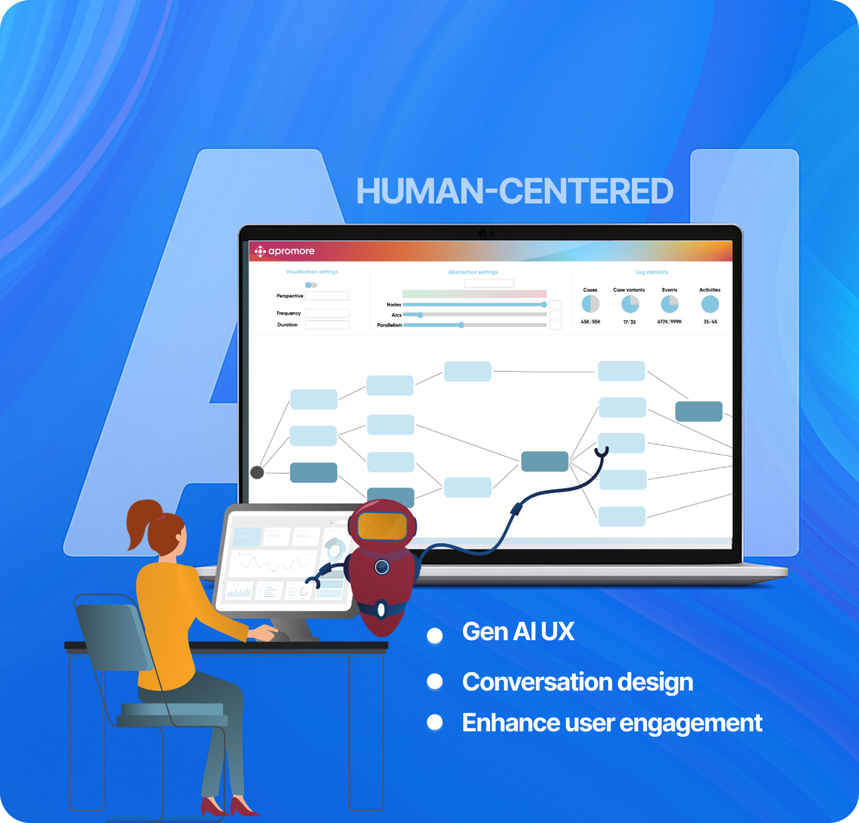
The Process
We followed a user-centered design thinking process, focusing on understanding users' pain points and business needs. Our goal was to create a solution that balanced usability, business value, and technical feasibility through continuous feedback loops and iteration.
Key Steps:
The Outcome
We delivered a research-backed, developer-ready design solution that significantly improved product clarity, usability, and team efficiency. Early validation through usability testing demonstrated measurable gains in user performance and perception.
Key Results:
- MVP and recommendations were positively received by stakeholders and clients, reinforcing long-term roadmap alignment
- 2× increase in user adoption within the first month post-launch
- 70% decrease in user drop-off between key task steps